AT&T Stadium
- 1st Review approval, full UX + UI
- 72 Screens designed in 1.5 weeks
- 1M+ App downloads (Android)
AT&T Stadium welcomes close to 2 million visitors a year, and the Official Dallas Cowboys App, with more than a million downloads on Android alone, is how many of them find their way around. The stadium needed a wayfinding experience for kiosks on the concourse and for the phone in a fan's hand. Built on Mappedin, an indoor mapping platform that powers navigation through the venue.
The goal was to turn that engine into something fans could use without thinking: find your seat, find what's near it, and carry the route from a kiosk to their phone. The design had to answer to two brands with strong, different identities. The Cowboys bring heritage and a structured, navy-led system. AT&T brings connectivity and a brighter, action-driven palette. The app design called for a harmonization and application of both brands.
I was brought in through THE·TEAM to lead the UX and UI on a two-month build, delivering a new milestone every two weeks: initial UX direction, full UX layout, initial UI direction, and full UI layout. A second phase followed, supporting the development team at Gen City Labs through build, install and launch.
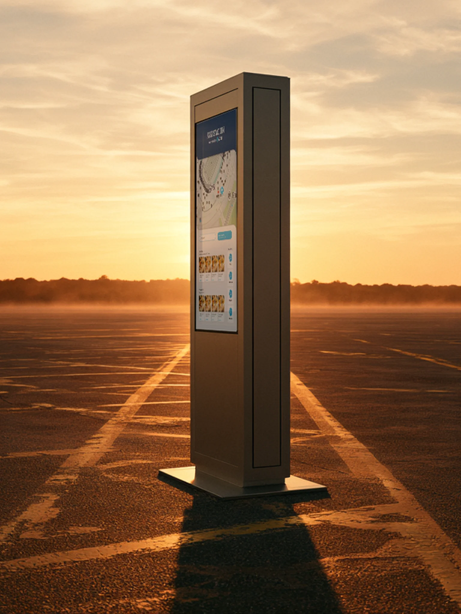
The direction needed to belong to AT&T's latest app redesign without repeating it. Same family, its own identity. Early on, my creative director and I went back and forth on whether the whole experience should read as an even partnership between the two brands, or lean harder toward AT&T as the one funding the build. We landed on dividing by role instead of by proportion, which gave both brands a clear, defensible claim without anyone having to argue over a percentage. Cowboys own structure: Cowboy Blue in the top navigation and category browse backgrounds, the frame you move through. AT&T owns action: buttons, SeatGeek connection moments, amenity callouts, everything you tap to get somewhere. One family mark, the AT&T switchback shape, carries through as a shared identity element. From there the look became Stadium Grey: desaturated and led by photography, so the venue does the visual work and the brand colors are saved for the moments that matter.
That direction became a short set of rules anyone on the team could design within. Glass only sits over imagery or color, never a flat surface, so an overlay always has something to read through. Gradients in AT&T color are desire paths, they point toward where you're going instead of decorating the screen. One saturated blue primary action per screen, so the next step is never in question. And kiosk scale is its own discipline: screen-safe zones and tap targets sized for a standing fan at arm's length, with kiosk module sets that differ from mobile while staying recognizably the same product. I built a componentized brand system to hold all of it, so the dev team could see at a glance what repeated and build it once. With the system in place, I designed 72 screens in a week and a half.
A dual-brand system lives or dies on consistency, so I built tooling to enforce it instead of relying on anyone remembering the rules: an auto-frame plugin that frames any selected imagery or shape to spec in one action, and a brand font replacer that updates every element in a file to its correct AT&T Sans or AT&T Aleck Sans weight in one click. For the kiosk especially, I prototyped key flows in Claude to feel them at the pace they'd actually be used, standing, in a crowd, often in a hurry.
Setting rules early is faster than reviewing taste late. Once the system was clear, every screen had an answer to "does this belong?" before anyone asked. That's why, when the complete UX and UI came together, there was nothing left to say, leadership approved it on first review with no changes, a first for that team — helped along by a creative director who was relentless about getting both sides to agree on where those lines sat before a single screen got designed. The plugins pushed that further: when the system lives in the tooling, consistency stops depending on anyone's memory, including mine.
The other lesson is about inheritance. Working inside an existing brand family doesn't mean repeating it. The strongest version of this app takes the parent system's logic and gives it a venue of its own, and that's the posture I bring into any project that has to extend something bigger than itself rather than invent in a vacuum.
See it in action. Download the app and select the "Stadium" button →